Best SaaS Website Designs That Inspire in 2026
.jpg)
.avif)
.png)
.png)

.png)
.png)
Looking for the best SaaS website designs to inspire your next product launch or redesign? You’re in the right place. This curated list of the best designed SaaS websites showcases brands that combine stunning visuals, intuitive UX, and conversion-focused layouts.
From clean interfaces to bold branding, these best-looking SaaS websites set the benchmark for how modern SaaS companies attract users, communicate value, and drive growth in 2026.
Why Great Design Matters for SaaS Websites
Design isn’t just about aesthetics. From trust to conversions, a strong website design drives every step of the SaaS user journey. Contemporary SaaS brands have recognized this power and are embracing visual storytelling and UX-driven design to build trust, clarity, product adoption, and conversions.
17 Best SaaS Website Designs
Find your way to our list of 17 exceptional SaaS website designs that stand out for their UX, UI, and visual conversion-focused layout strategy.
1. Flotorch
Flotorch’s website design is sleek with a contemporary dark theme and color gradients that highlight its value proposition clearly. The visual hierarchy and CTA buttons are well-defined for conversion optimization. There are also interactive product demos that build trust and engagement.
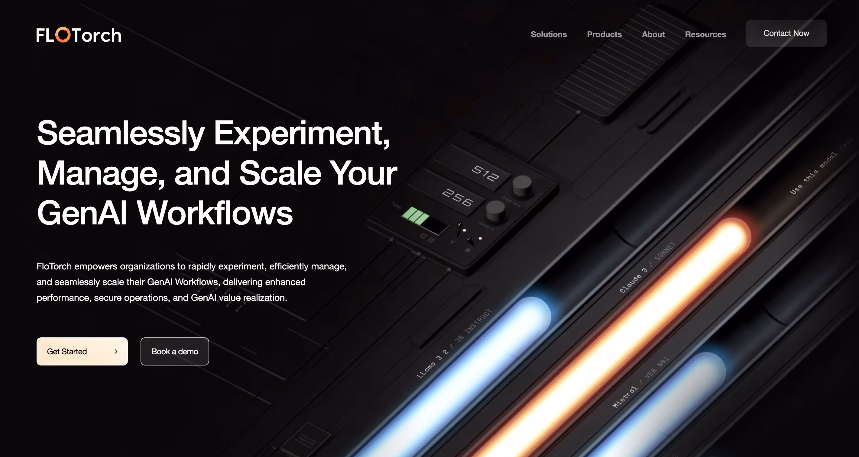
Designed by Pixeto
2. Nuraform
An AI-powered form builder, Nuraform lets you generate visually engaging forms within seconds. Its website is made of bold gradients, minimalist layouts, and seamless motion-driven transitions that feel like a full experience. With its clean typography, crisp value proposition, and fluid UX, Nuraform’s site is a strong example for a SaaS website that does its job within a few seconds.
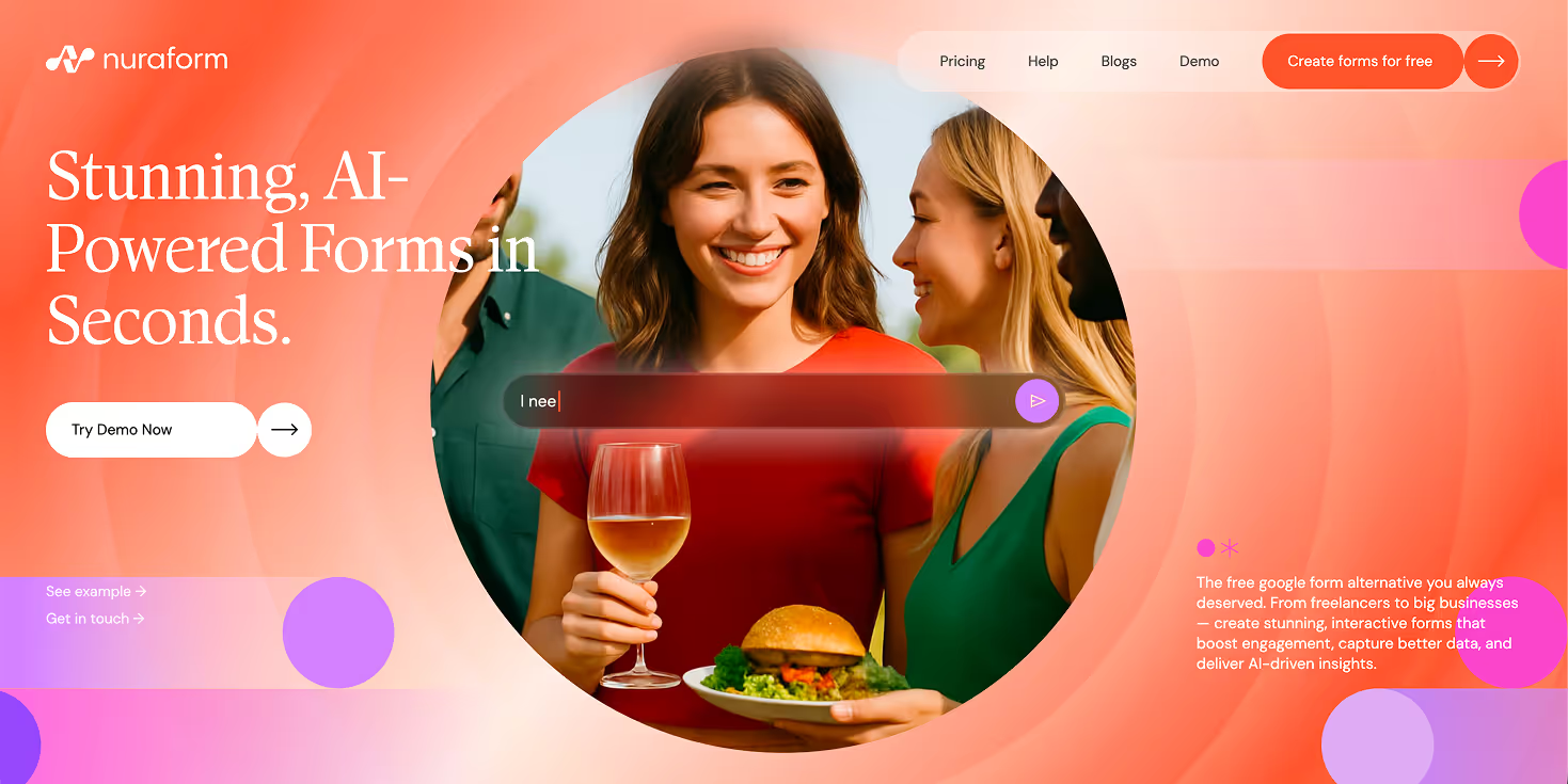
Designed by Abhishek Jha
3. Opal
A one-stop platform to automate your agency, Opal’s website offers a seamless user experience (UX) with a fully responsive design, making it visually striking and intuitive to navigate. It captures attention through guided storytelling, animated product demos, and text and visual blocks that highlight key information in an appealing way.

Designed by Pixeto
4. Invary
Invary, a cybersecurity and software integrity tool, stands out with its modern minimalist layout and interactive design. The focus of this SaaS website’s design is to present information in a clean, no-nonsense format. The homepage communicates its value proposition immediately, and animated visuals simplify complex product concepts.
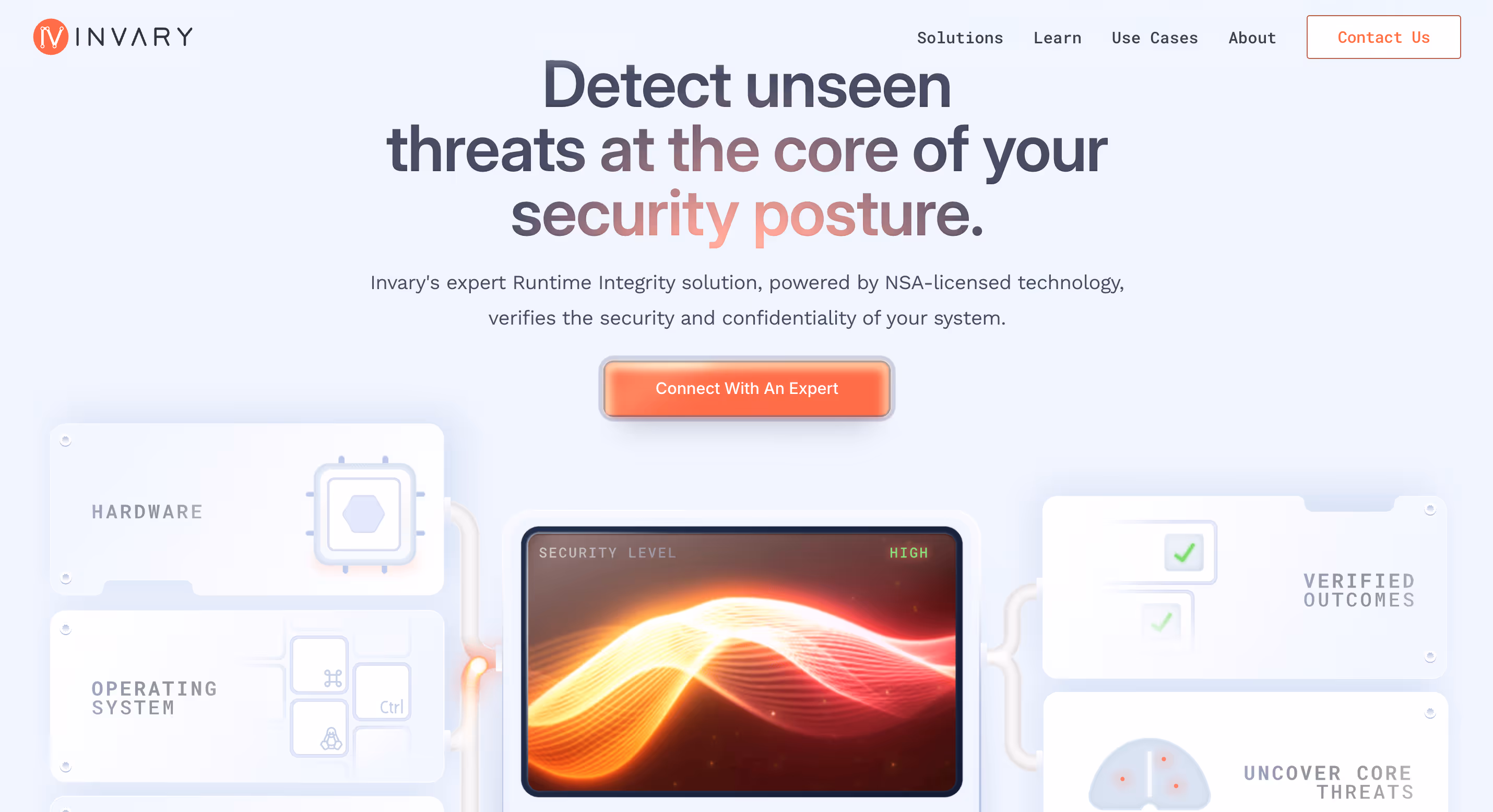
Designed by Pixeto
5. Huly
Huly, a project management and collaboration tool, brings together a dark interface with bright color blocks, as seen above. It uses a motion-based storytelling approach with fluid transitions and dynamic interactions that make the UX feel alive. A playful color palette combined with smooth transitions helps visually narrate the brand’s story.
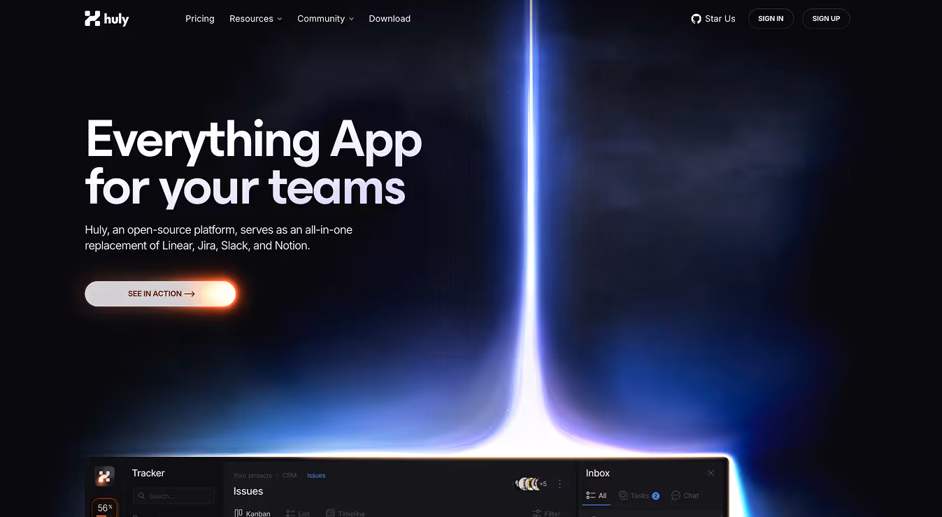
Designed by PixelPoint
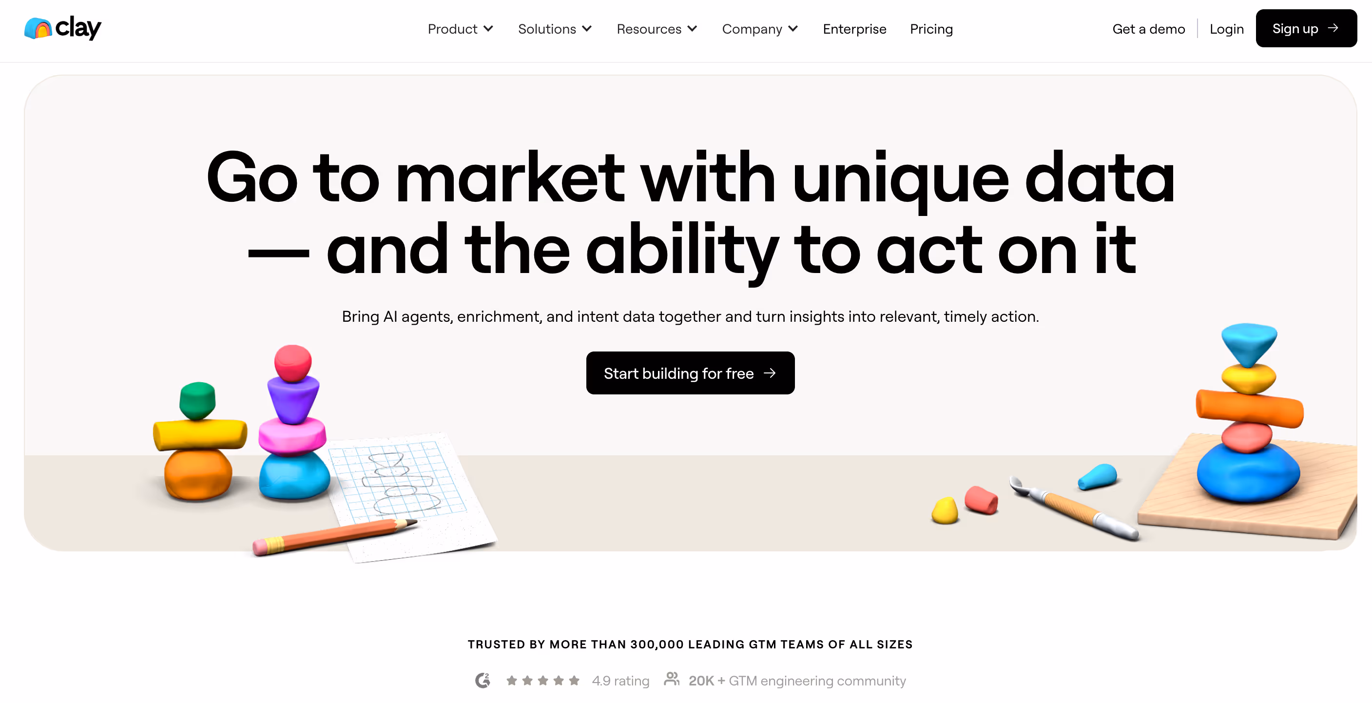
6. Clay
Clay, a personal AI-driven CRM tool, blends bold typography, straightforward product demos, and minimal illustrations to give users exactly what they’re looking for: direct information. Their logo appears throughout the site in different variations, creating a distinct and unique visual identity.
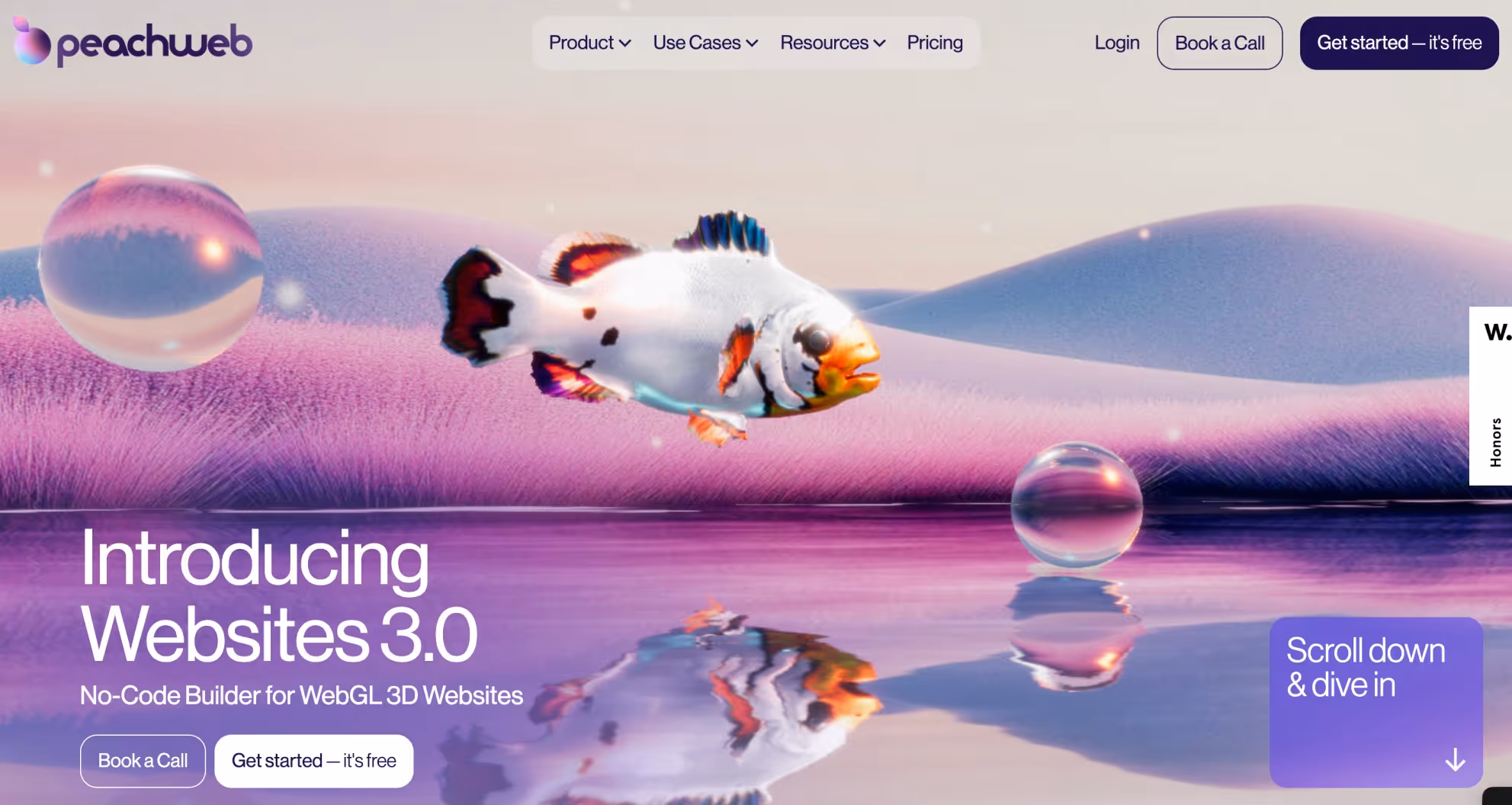
7. Peachweb
A 3D website experience builder, Peachweb is a site to behold in every way, pun intended. The homepage goes right into interactive mode where the element tells you the story. It focuses on using ample space with an equal blend of text and visuals to communicate what matters.
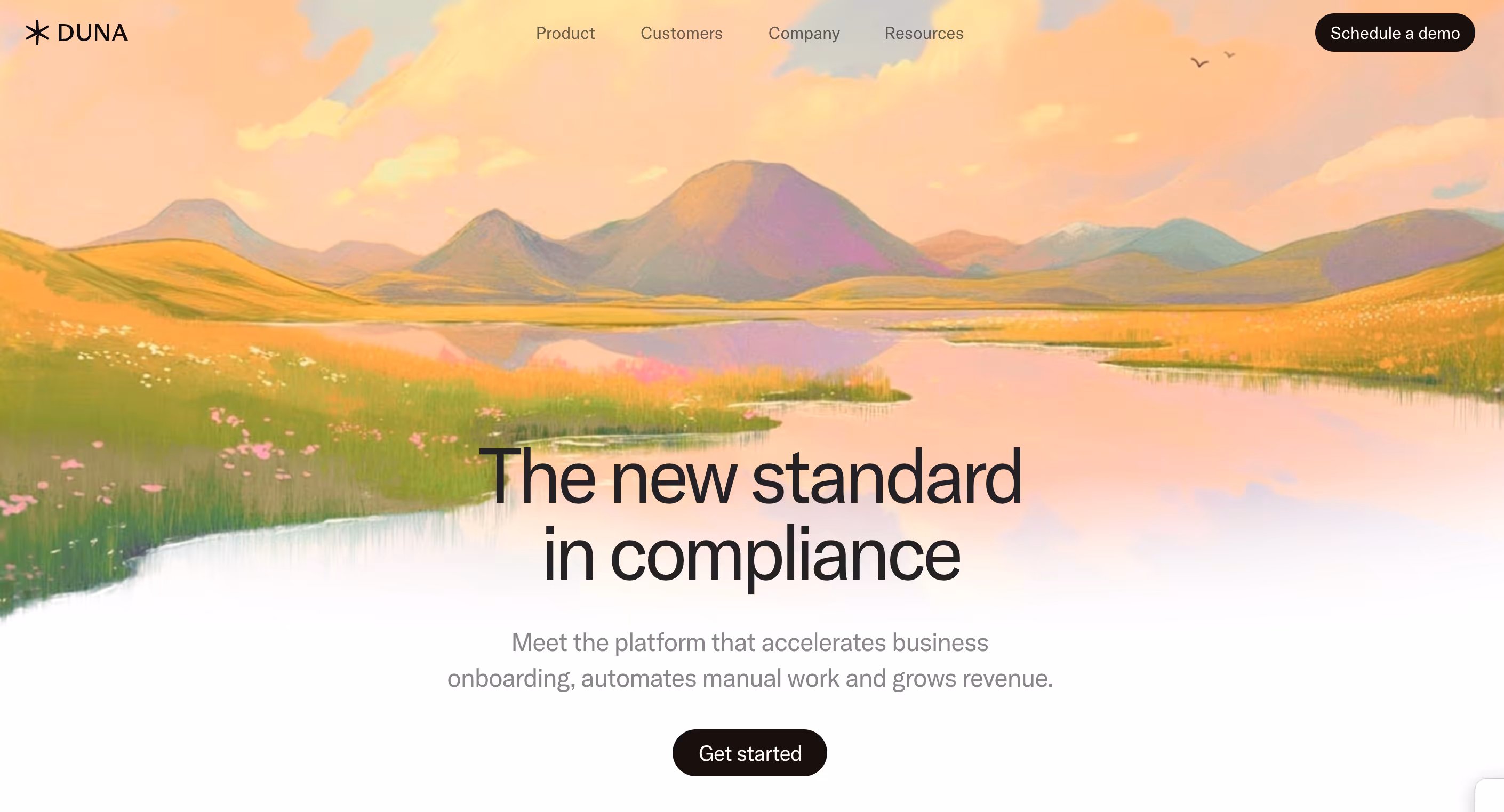
8. Duna
Duna, a digitalisation solution banks on minimalismm quiet and a sense of serenity in its SaaS website design. The clean layout, warm gradients, and intuitive CTA flow make for a calming yet persuasive user journey. Its value proposition is clear at first glance, while the simplicity ups the reader’s interest and attention.
9. Attio
Attio is an AI-native CRM platform designed for go-to-market teams. Its website stands out for its sleek monochromatic layout, bold typography, and dynamic light-to-dark transitions. All of this makes the product experience come alive. They showcase their value proposition in a clean, conversion-focused way.

10. Adaline
An end-to-end platform built for product and engineering teams to train LLM models, Adaline beautifully blends storytelling with functionality. The homepage is serene and calming, giving users a warm welcome. The copy and typography delivers clarity at a glance. They also use whitespace and structured blocks to guide users in a simple way.

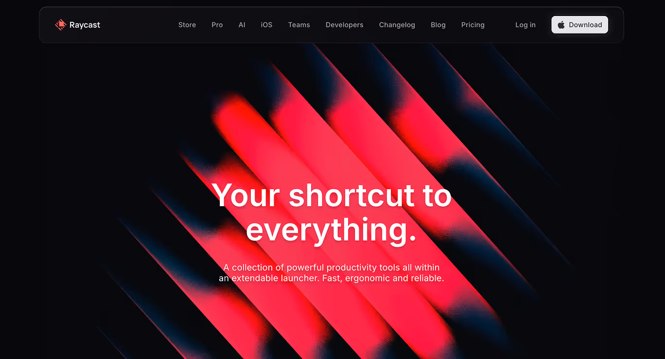
11. Raycast
A collection of powerful productivity tools, Raycast’s homepage resembles a cool music studio with its gradient overlays, crisp typography, and minimalist copy. The homepage uses high-impact visuals and intuitive structure to guide users from problem to solution. With responsive design, subtle motion cues, and a clean layout, Raycast’s site delivers a seamless UX and modern visual design that instantly communicates its offerings.
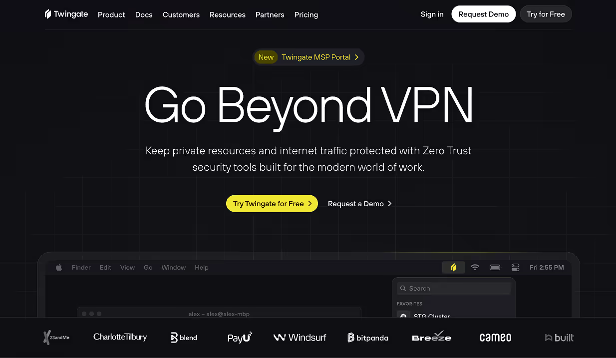
12. Twingate
Twingate, a Zero-Trust Network Access (ZTNA) platform built to replace legacy VPNs uses a bold dark-mode aesthetic paired with vivid accent colours that immediately convey modernity and serious security tone. Its value proposition is front and centre across the homepage, while each fold is strategically thought with a communication perspective.
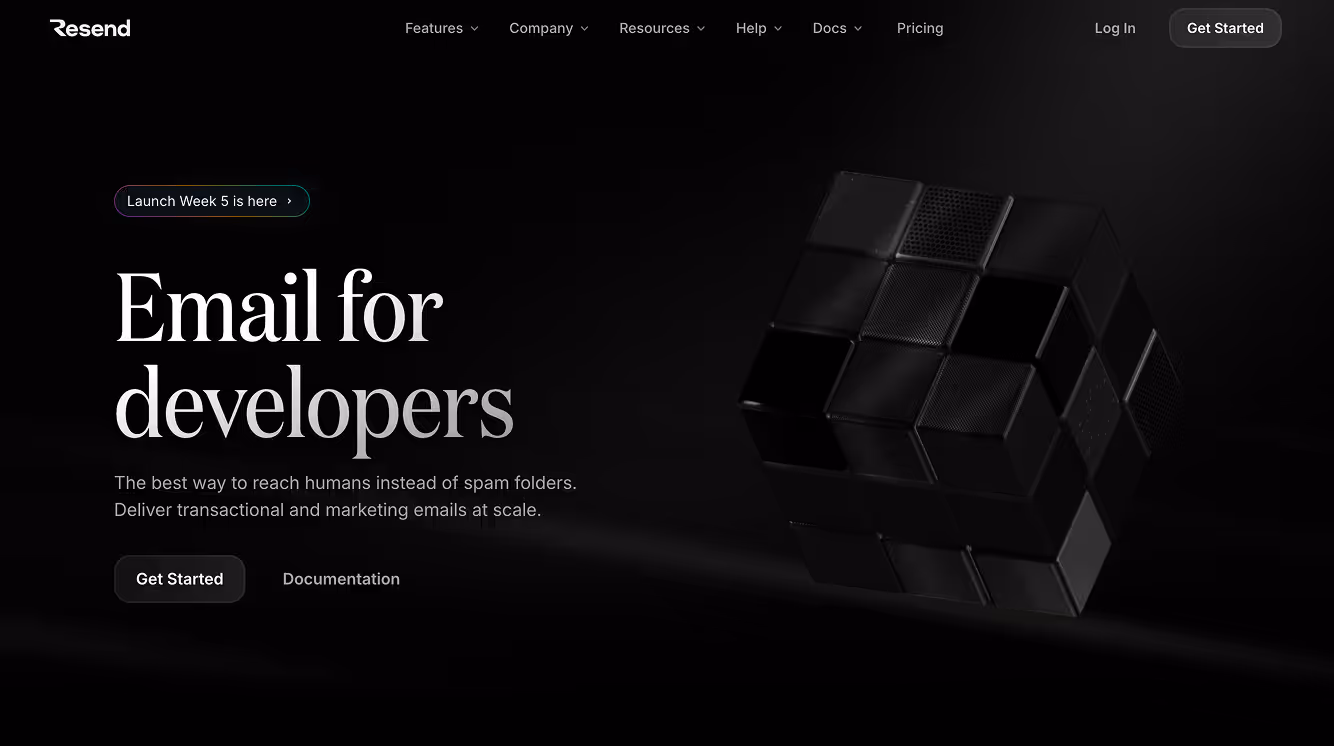
13. Resend
Email for developers. The moment you visit Resend’s website, you instantly know who it is for. Their website is elegant and uses a dark-mode theme with minimalistic aesthetic, somehow matching their target user’s aesthetic. A mix of subtle animation and minimal text blocks focus on the specifics and get to the point without beating about the bush.
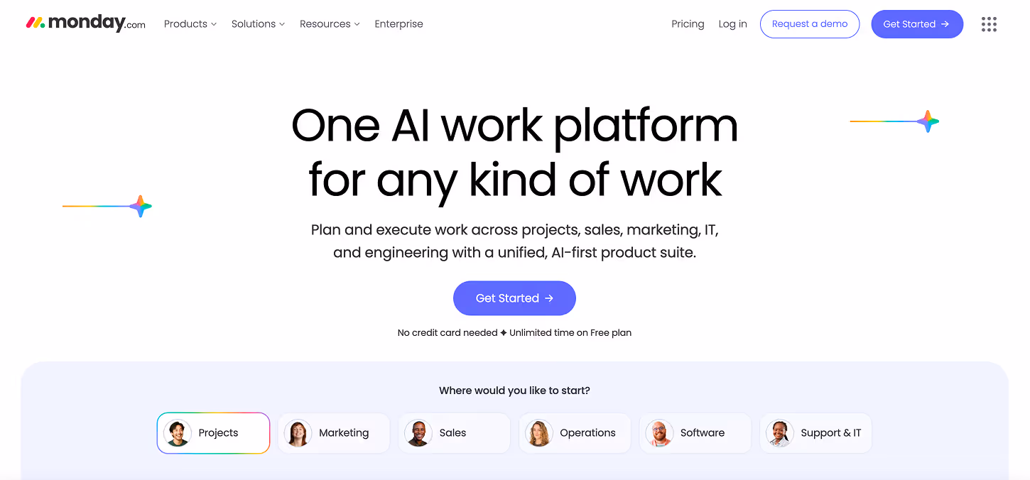
14. Monday
Monday, a team management platform, immediately showcases its ease of use by guiding visitors to try the tool right above the fold. Social proof is displayed prominently, along with a visible free plan that drives sign-ups and reduces friction within seconds. The homepage masterfully uses whitespace and structured blocks to communicate the brand’s value with clear, compelling copy.
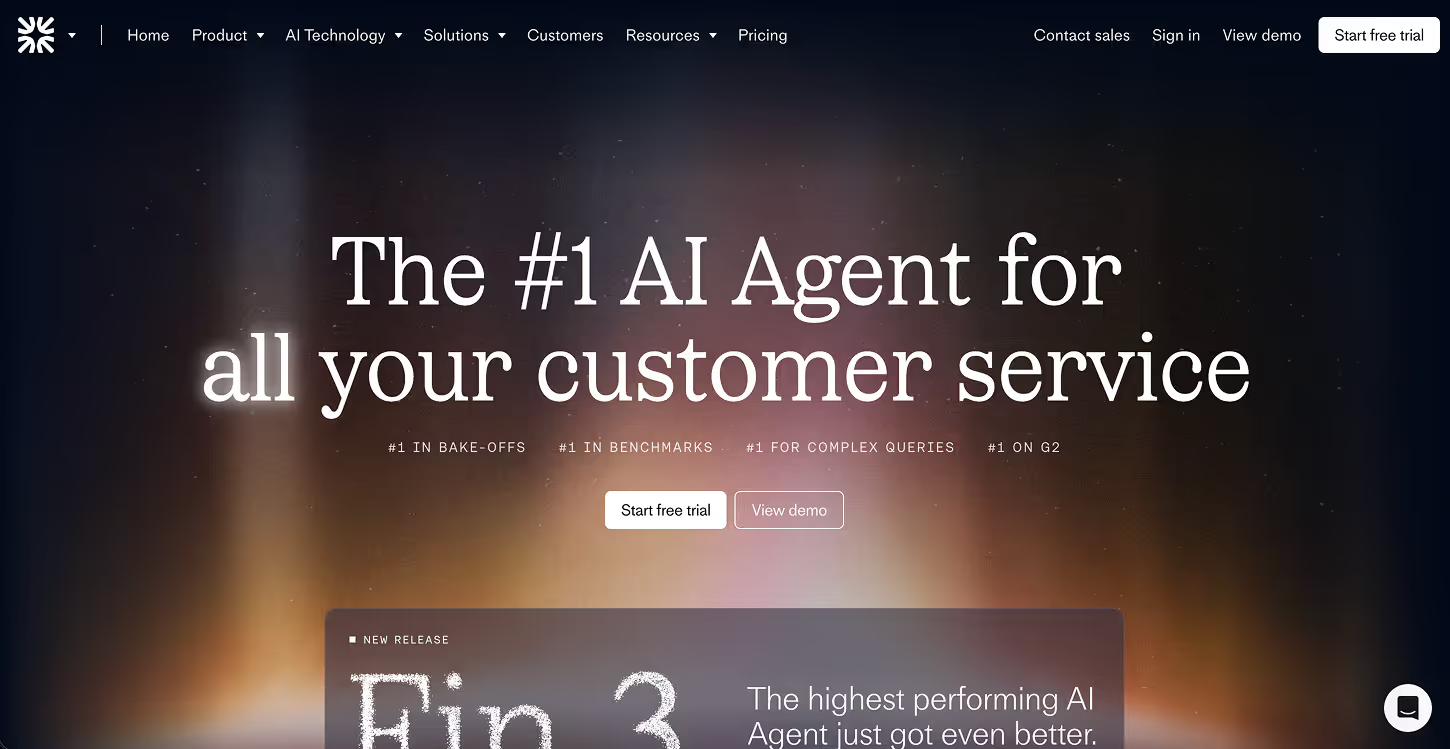
15. Fin.ai
Fin (part of Intercom), an AI-powered customer service platform, focuses on simplicity first. It uses a minimal, one-page homepage that gets straight to the point with a clear value proposition and crisp illustrations. Through micro-interactions and animations, the site brings personality and interactivity, all while staying focused on communicating its core message.
16. Petal
Petal, a credit card company screams freshness as soon as you visit their website. A soothing. inviting approach that reduces the mental association one normally has about credit cards. The use of ample white space and impactful copy simplifies what might seem a complex financial proposition. The entire look is very approachable, full of clarity and eventually higher clicks.
.jpeg)
17. Safetykit
SafetyKit’s website is bold, instantly attractive, clean and well laid out. You get their value proposition in the first fold itself with a clear headline, concise messaging and a direct focus on the CTA. The content is pleasing, as it's easily scannable, building ease and trust in terms of the experience.
You also see strong social proof which builds credibility while product visuals help users understand Safetykit’s services with ease.
.jpeg)
These designs succeed because they follow proven B2B website best practices.
Key Elements of a High-Converting SaaS Website
What makes SaaS websites look that good while also nailing their main objective: conversions?
- Clear Value Proposition Above the Fold
The best-designed SaaS websites tell their story within seconds. They offer a clear, compelling value proposition above the fold, instantly telling their product’s story and how it solves the user’s problem.
- Strong CTAs and Visual Hierarchy
You’ll find strategically placed, action-driven calls to action (CTAs) on the best-designed SaaS websites. This creates a seamless user experience (UX), ensuring nothing feels random and every scroll serves a purpose.
- Clean UI with consistent branding
Inspiring SaaS websites have minimal interfaces with ample breathing space, paired with consistent use of brand colors and typography. This approach works to build brand identity and trust, no matter where the user is on the site.
- Engaging Product Visuals and Demos
Static screenshots are passé. Interactive product demos, animations, and micro-interactions are in. Modern SaaS sites showcase their product in motion, letting users get a feel before they get to the next step.
- Optimized Loading Speed and Mobile Responsiveness
Quick-loading and adaptable websites are the foundation of a great SaaS website. Even with advanced, responsive, and interactive design elements, a well-designed SaaS website isn’t just good UX; it’s powerful from the ground up.
Design Trends Defining SaaS Websites in 2026
- Minimalist Layouts and Bold Typography
This year has been all about less is more. SaaS websites in 2026 are doubling down on clean, whitespace-rich layouts that highlight what truly matters while avoiding information overload.
- Gradient and 3D visuals
More SaaS sites are incorporating layered gradients and 3D visual elements to amp their unique element. All of these visuals have a strategic approach and are there to focus on product offerings, rather than being mere decor.
- Dark Mode Aesthetics
Dark-mode isn’t just limited to being your phone setting. Dark mode has come to be a design aesthetic for SaaS websites, offering high-contrast readability, reduced eye strain, and a luxe feel.
- Personalized UX with AI-driven Elements
SaaS websites in 2026 are increasingly leveraging AI-driven personalization: dynamic content, adaptive layouts tailored to user behavior. This focuses on better conversions where the website feels more responsive and attuned to each visitor.
How to Design a Winning SaaS Website for Your Brand
A successful SaaS website isn’t just beautiful, it’s built on strategy. Here’s how to make one that converts:
Step 1: Be Crystal Clear
Define your value proposition in one powerful line that instantly tells visitors what you do and how it improves their life.
Step 2: Design for your Audience
Make sure all of your user journeys and layouts are intuitive and purposeful to drive your audience.
Step 3: Use Strong Visuals
Use screenshots, motion demos, and illustrations to play out your product’s value.
Step 4: Focus on UX and conversions
Every design element: from typography to your CTA button placement should guide users to act.
Step 5: Test, iterate, and optimize
A/B test and study your analytics to refine your design and messaging continuously.
Looking to bring your SaaS vision to life? Pixeto specializes in designing high-performing SaaS websites that combine creativity, UX precision, and conversion-driven strategy, helping your brand stand out and scale faster. Book a free clarity call today.
Mistakes to Avoid in SaaS Website Design
Even the best ideas can fall flat if you get stuck with:
- Overloading pages with text or visuals: Too much content is overwhelming. Users are already inundated with information. Keep your core message clear and concise.
- Weak product positioning: If visitors can’t immediately understand what you do and how it improves their life, they’ll leave. Make your product the hero of their life.
- Generic templates without personality: Using pre-made, overused templates makes your brand forgettable. Make sure you infuse your unique brand elements across your website.
- Slow-loading assets or videos: Long load times equal off-the-charts bounce rates. All your media should be optimised to load when it must, which makes choosing the right web builder even more important
- Ignoring responsive design: A great SaaS site works flawlessly on every device. Your web builder should have the capability to have it optimised for every device it can be seen on.
Most modern SaaS layouts rely on responsive web design.
Turn Inspiration into Action with Pixeto
Exploring the best SaaS website designs is a great first step, but the real value comes from applying those ideas to your own product. The best designed SaaS websites don’t just look good; they communicate value clearly, guide users effortlessly, and convert traffic into sign-ups. That’s what separates good inspiration from real results.
If you’re ready to move beyond browsing and start building, Pixeto helps you bridge that gap. From UX-driven layouts to conversion-focused interfaces, Pixeto specializes in creating best looking SaaS websites that are fast, scalable, and designed to grow with your business.
👉 Visit https://www.pixeto.co/ to turn inspiration into a high-performing SaaS website built for real users, real growth, and real impact.
FAQs
1. What makes a SaaS website design successful?
A clear value proposition, adaptable navigation and powerful call-to-action (CTAs) makes a SaaS website design successful. The idea is to communicate your story above the fold, build trust with social proof and of course, look good and work well across all devices.
2. Which platform is best for designing SaaS websites?
The best platform for your SaaS website depends on what you’re looking for. Although, the top choices are Framer and Webflow if you’re wanting to create something visually stunning and powerful. Another way to design a winning SaaS website is reaching out to an expert web designer or agency who excel in this space.
3. How often should SaaS websites be redesigned?
SaaS websites should be redesigned in alignment with your company’s mission, vision, and user behavior. Does your website instantly communicate your core ideology? Does it provide a comprehensive overview and visually reinforce your branding? Are users responding well to it? Make tweaks every 6-12 months based on these learnings.
4. Do SaaS websites need custom development, or can they use templates?
SaaS websites can certainly use templates to create their website. However, they require custom design and development inputs to make them unique and fully functional. For this, choosing a website builder or platform that offers the right balance between flexibility and structure is essential.
5. How can I improve conversion rates through better design?
To improve conversion rates through better design on your SaaS website, you need to bank on clean, minimal design and simplify navigation with visually clear CTAs. A/B testing various design approaches is the best way to see what works best to improve conversion rates.


_%20Profitable%20%26%20Micro%20SaaS%20Ideas.png)
.svg)

